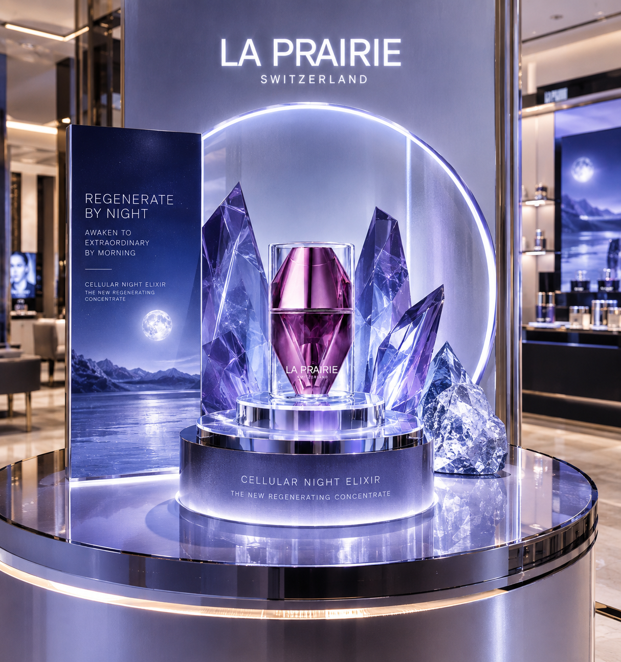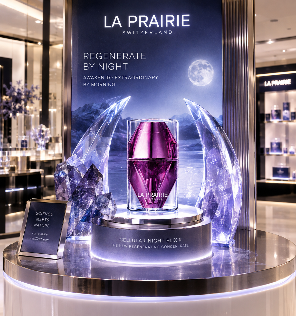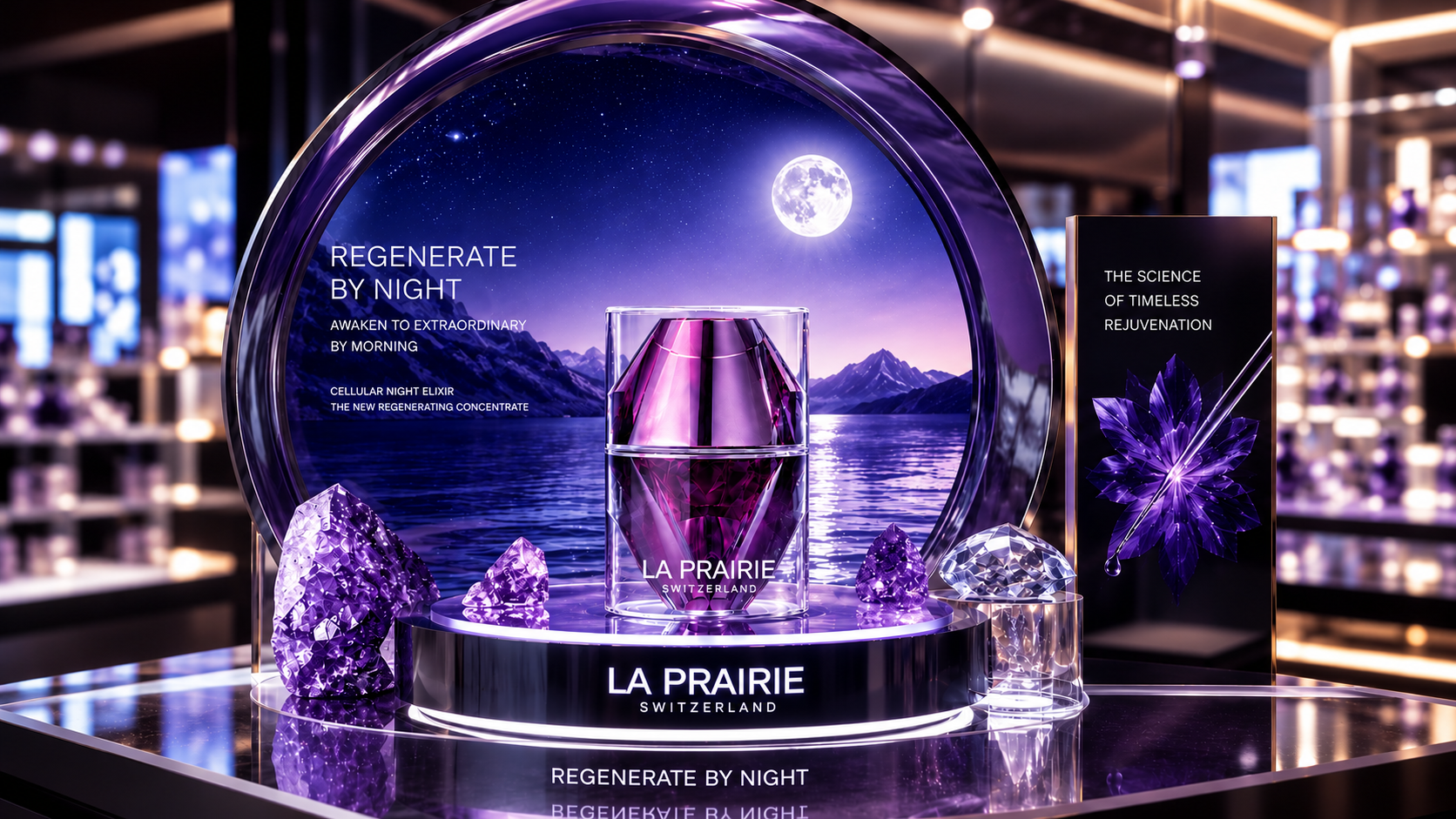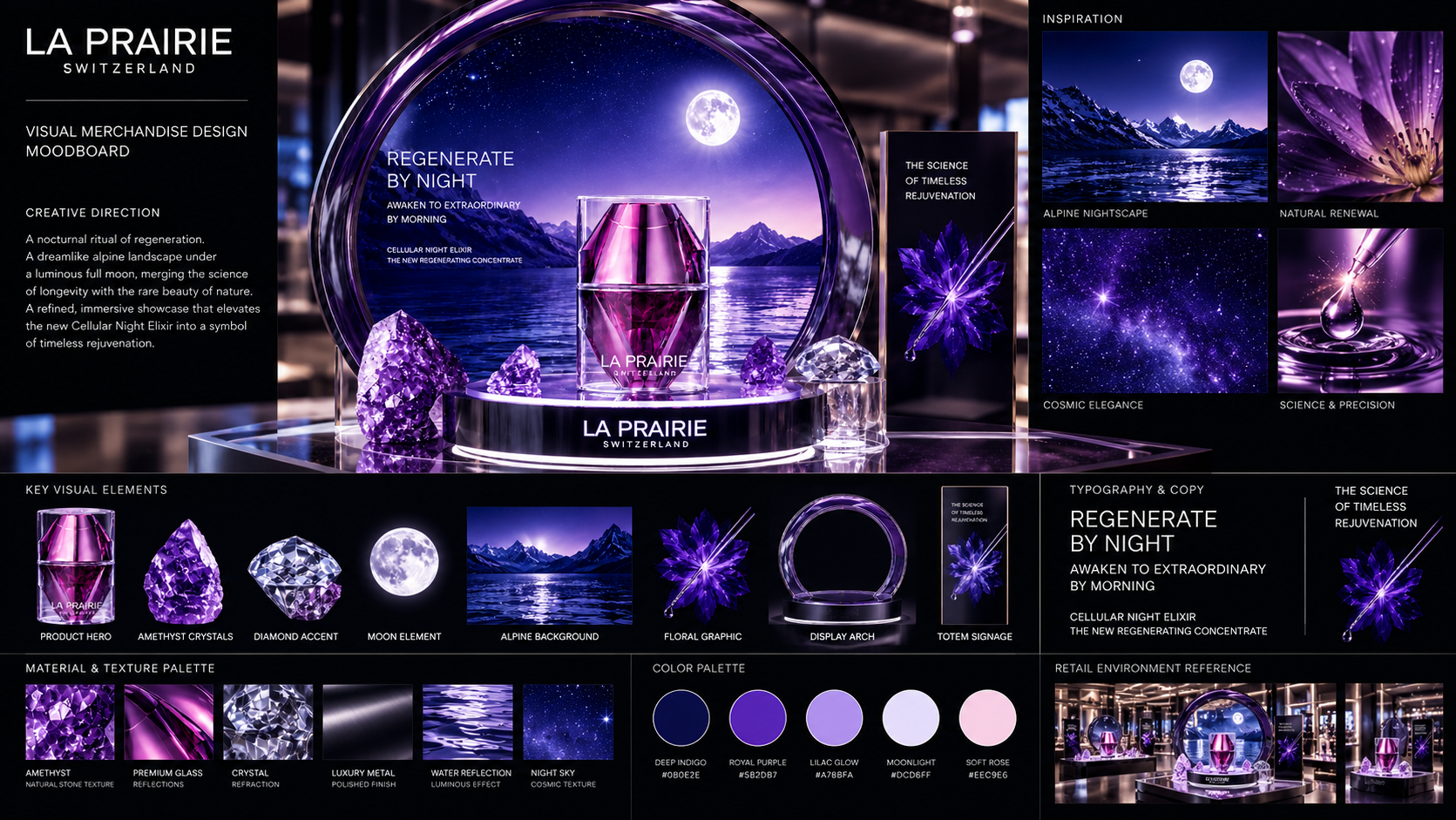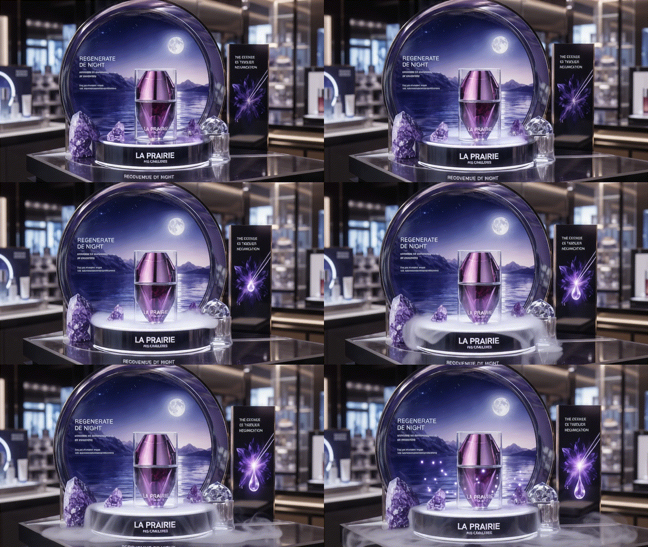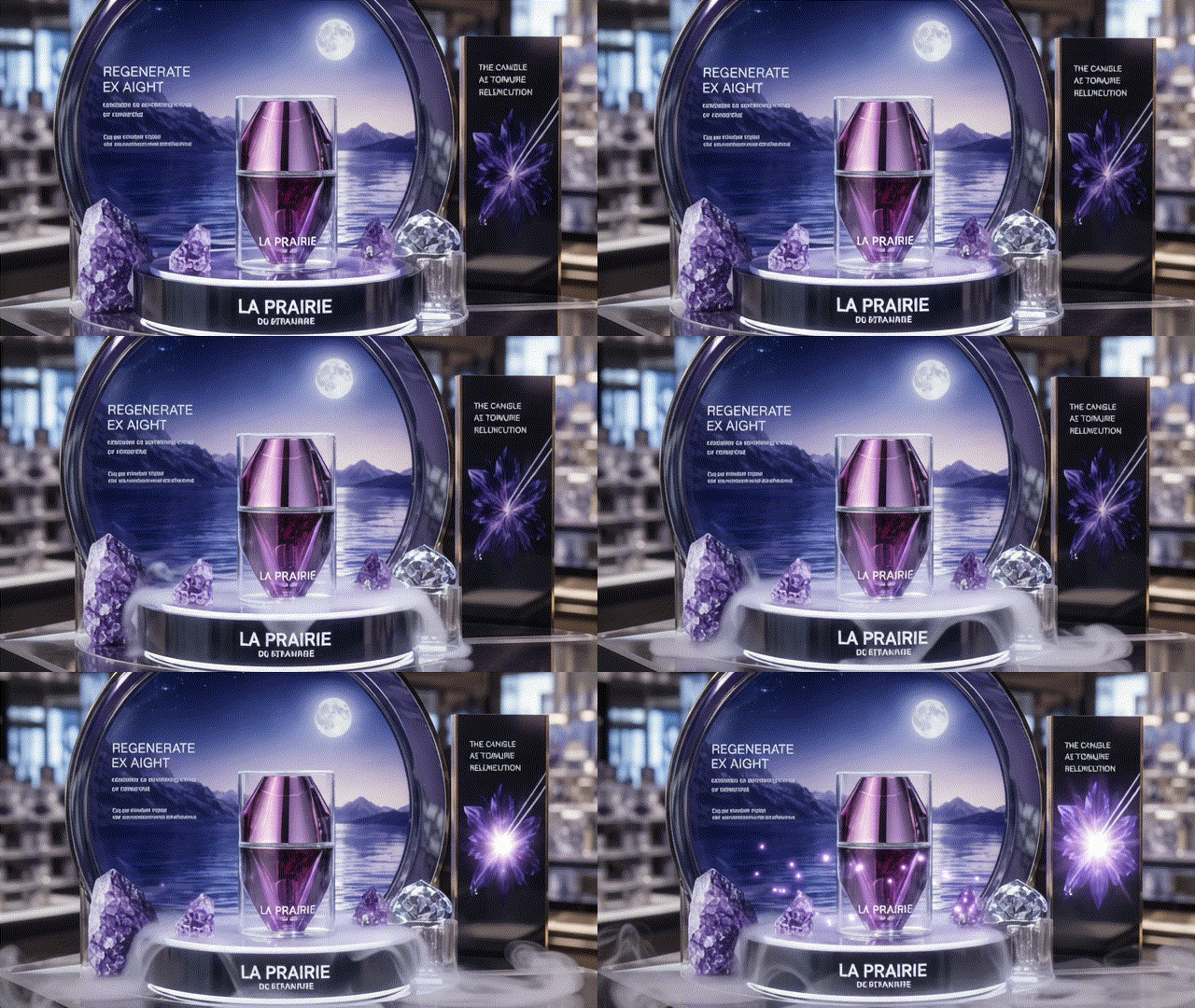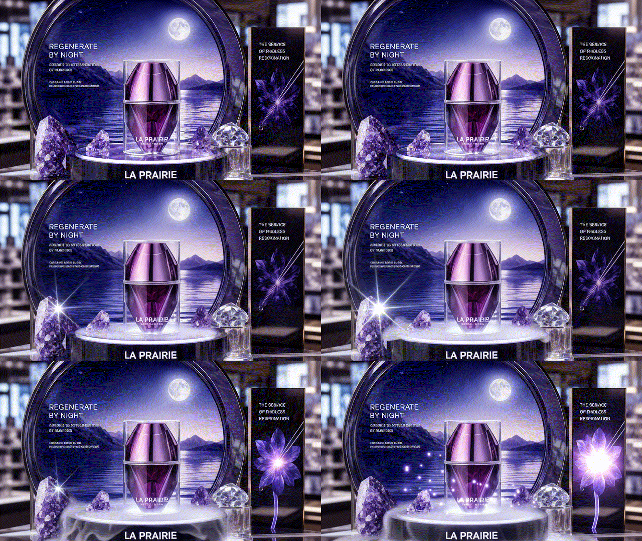
The Story
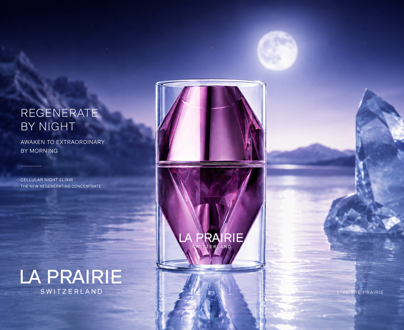
Based on La Prairie’s Science of Haute-Rejuvenation, the Platinum Rare Collection offers the highest performance to address all signs of ageing. It provides a noticeable line-smoothing effect and helps support the underlying structure of the skin.
LA PRAIRIE
The Brand
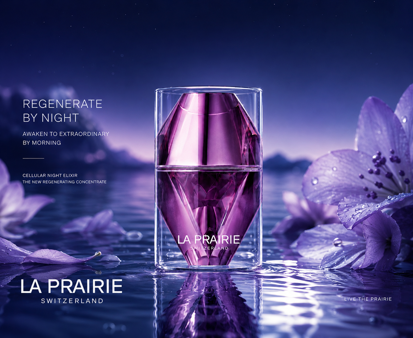
La Prairie’s Platinum Rare Cellular Night Elixir features an innovative rejuvenating formula that defends your skin while you sleep. Delivering energy directly to the skin, this overnight serum improves texture and elasticity for a rejuvenated appearance in the morning. It supports nightly regeneration, encouraging the detoxifying process and visibly reducing the appearance of lines and wrinkles.
The Problem
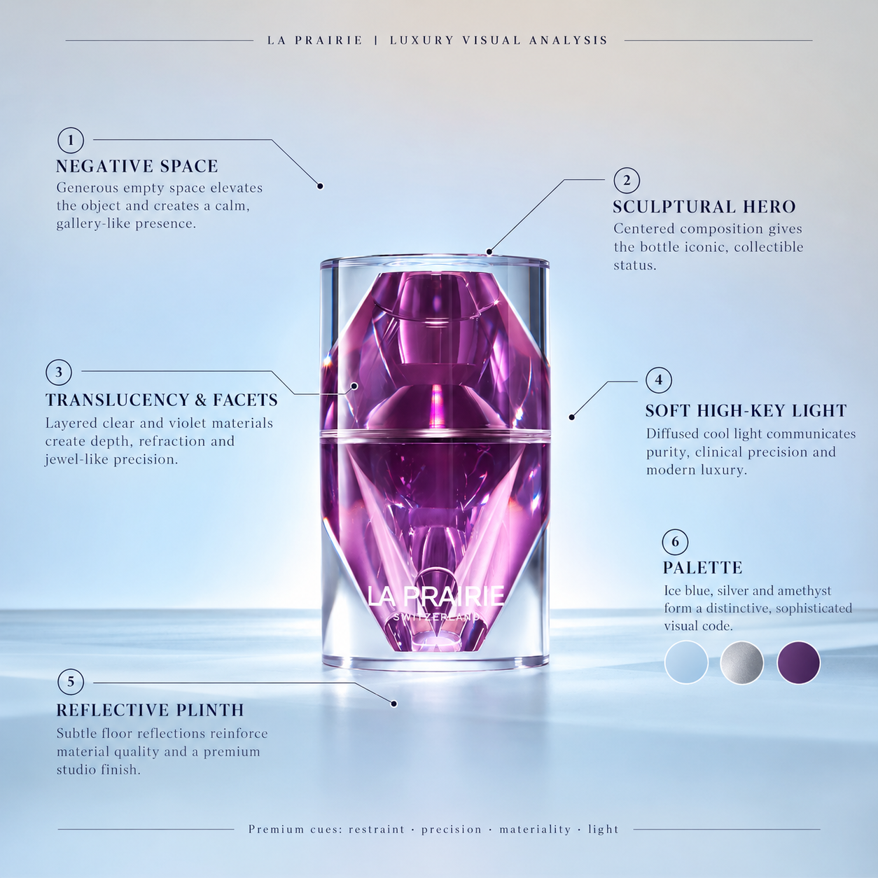
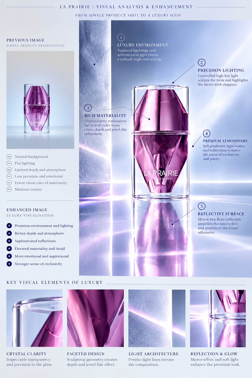
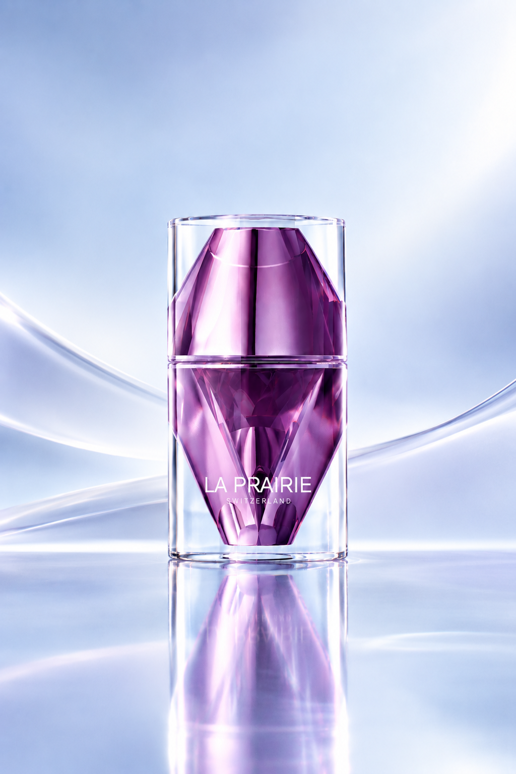
Luxury skincare often communicates prestige through expensive packaging, scientific terminology and polished product photography. However, these codes can make even an extraordinary formula feel abstract. Consumers need to understand what makes this product worth its premium price. The annotated visualisation highlights the key premium design cues: negative space, sculptural composition, translucent facets, soft high-key lighting, reflective surfaces and the ice-blue/silver/amethyst palette. These are the elements that make the product feel precious, precise and gallery-worthy.
The Solution
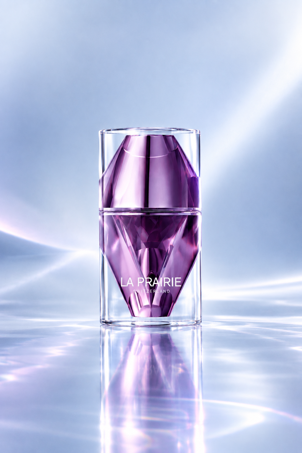
The enhanced visualisation introduces five key creative improvements.
01. Luxury environment and architectural composition
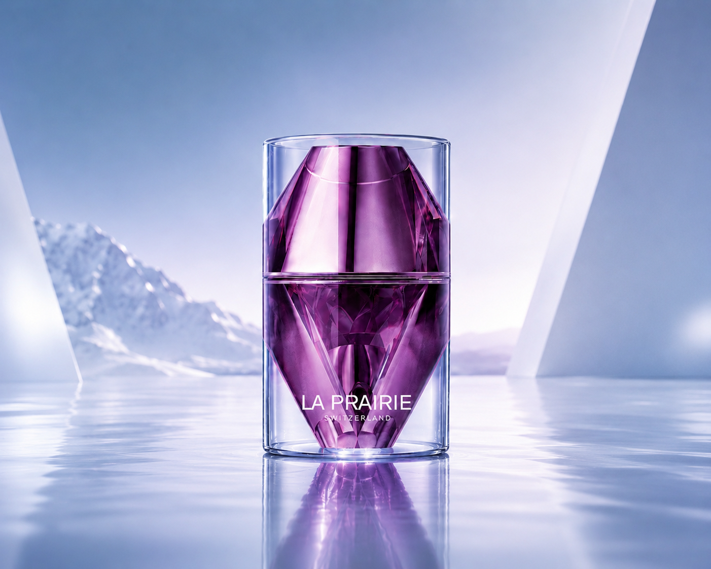
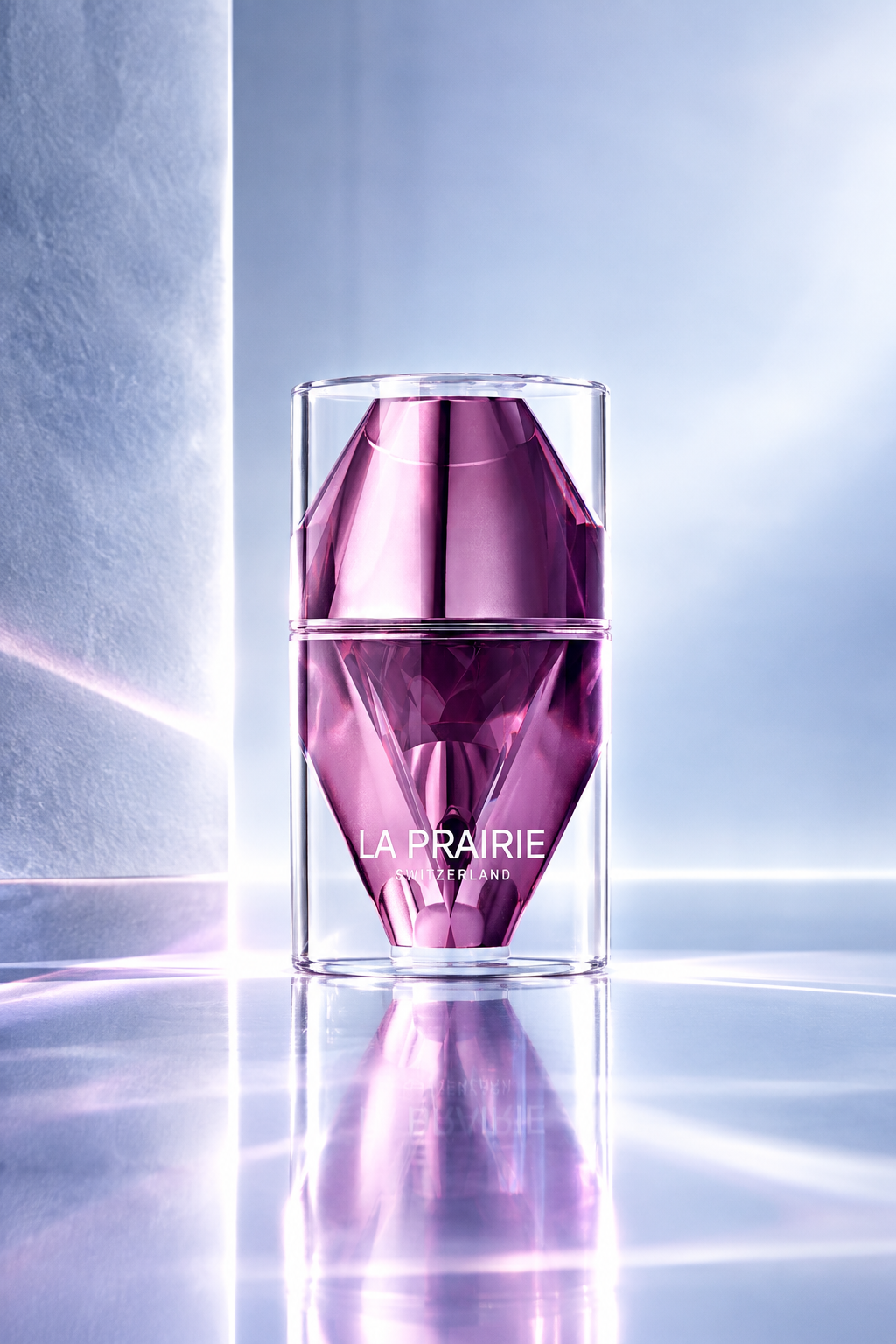
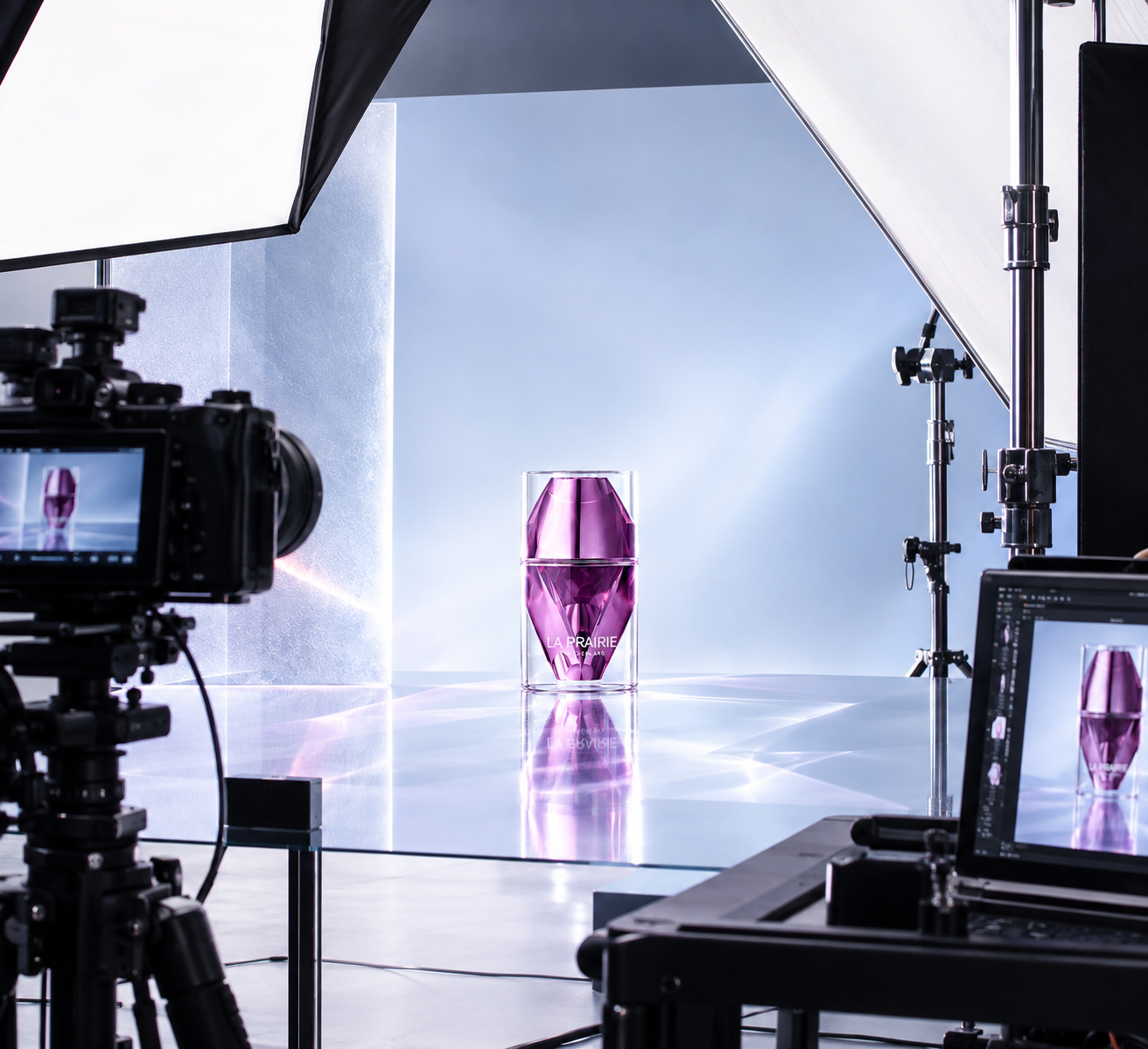
The neutral background is developed into a more immersive setting with textured surfaces, geometric divisions and subtle architectural light. This creates a sense of place and intentionality, elevating the image beyond a standard studio packshot.
02. Precision lighting
Controlled high-key lighting defines the transparent glass and illuminates the internal violet structure. Carefully positioned highlights emphasise the bottle’s contours and facets, creating visual contrast without losing the softness associated with premium skincare.
03. Richer materiality and depth
The transparency of the glass, the depth of the violet tones and the contrast between smooth and faceted surfaces create a more tactile visual experience. These details suggest precision, craftsmanship and refinement without adding unnecessary decorative elements.
04. Reflective surfaces and visual dimension
The mirrored floor reflects the bottle, reinforcing its central position and creating symmetry. The interaction between the product, the surface and the surrounding light adds depth, making the bottle feel more substantial and iconic.
05. A refined premium atmosphere
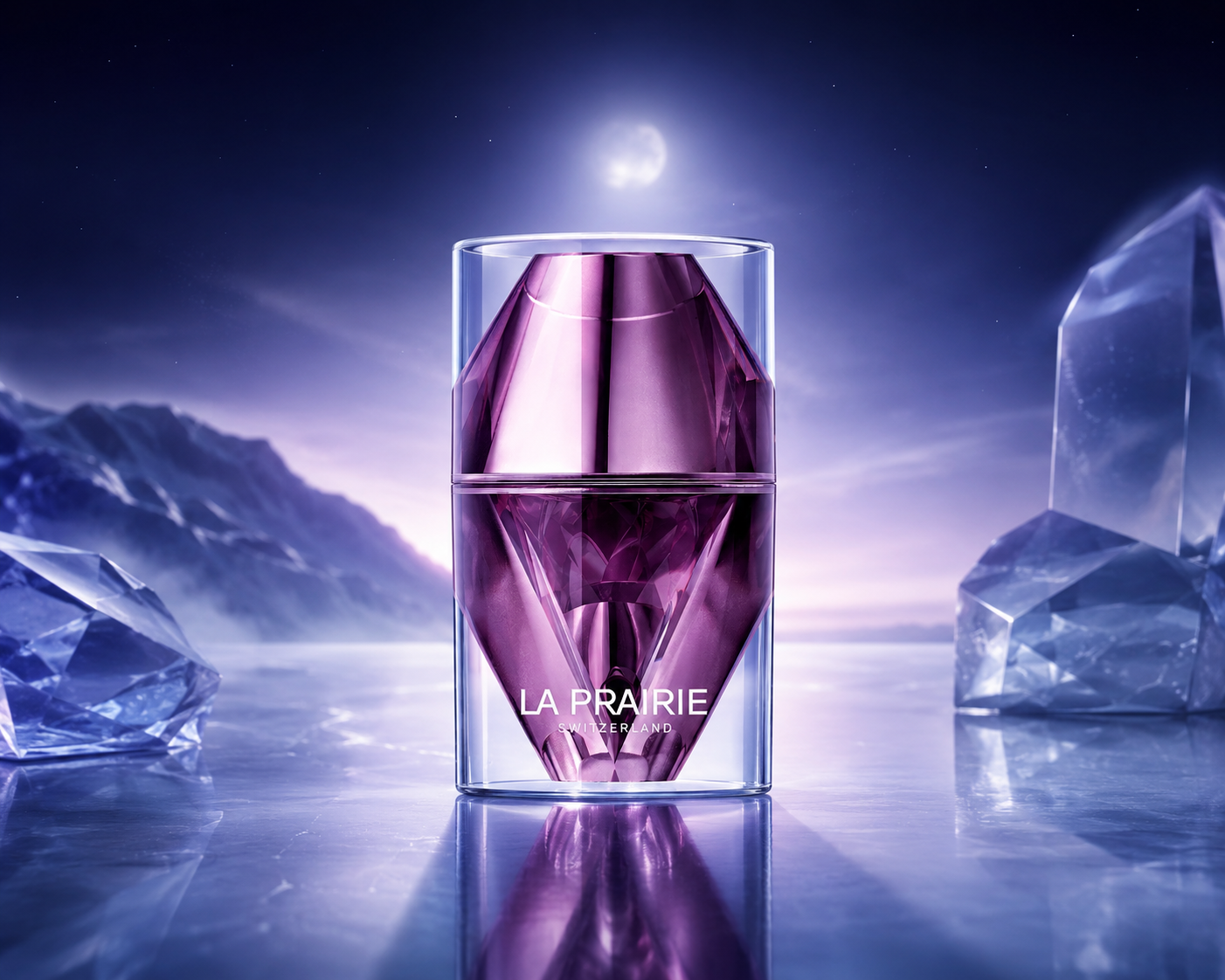
The combination of icy blue, silver, violet and soft magenta creates a distinctive visual palette. The luminous gradients and controlled light beams add emotional warmth to an otherwise cool environment, balancing scientific precision with sensory beauty.
The Insight
Night is when the world becomes quiet, and the skin enters its natural renewal cycle. The emotional value is not simply applying a serum; it is the promise of waking up looking refreshed. Platinum becomes a metaphor for precision, rarity and the quiet power of renewal.
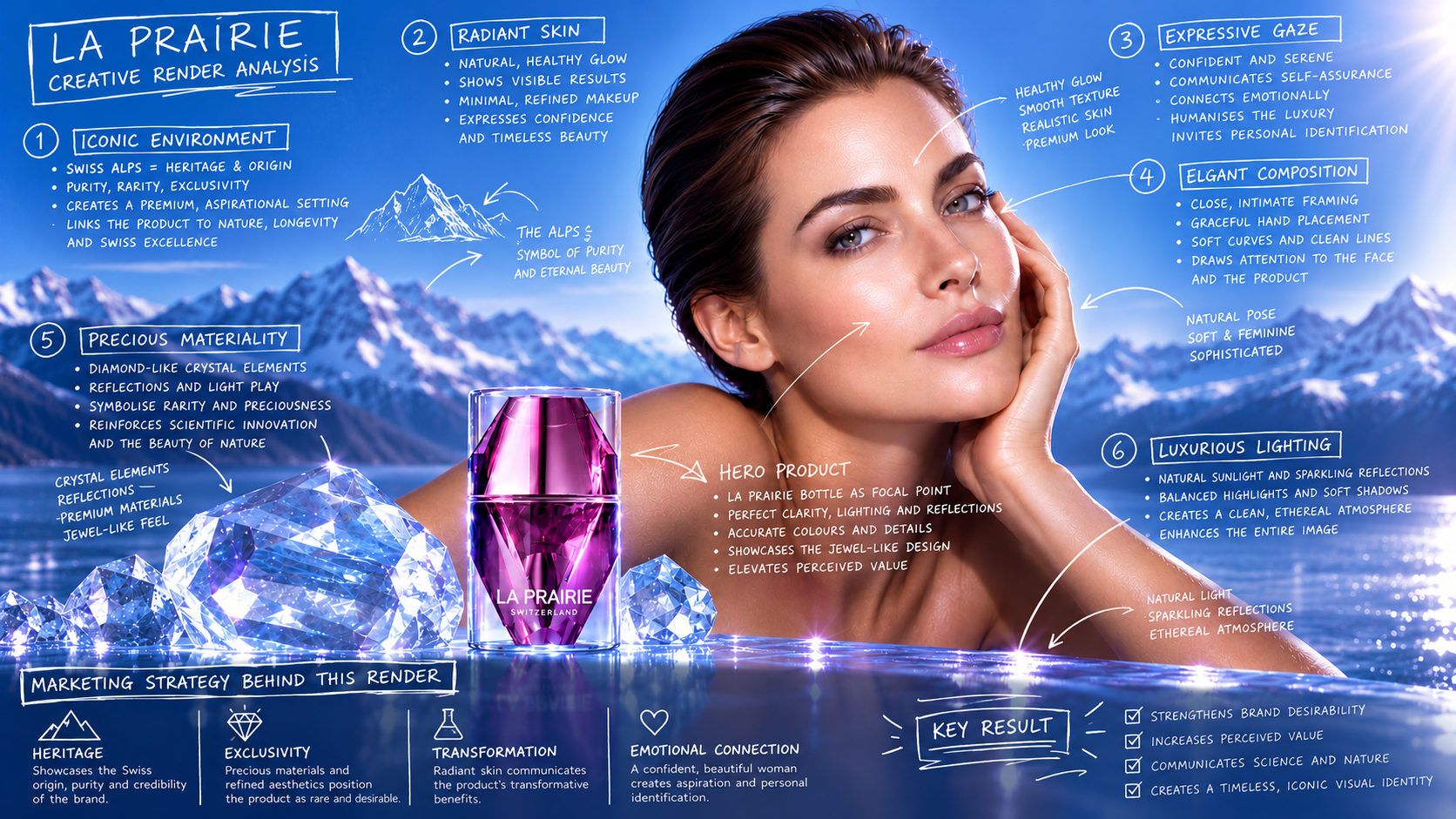
La Prairie — Creative Render Analysis
The Creative Impact
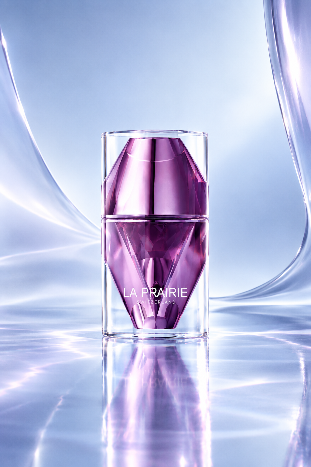
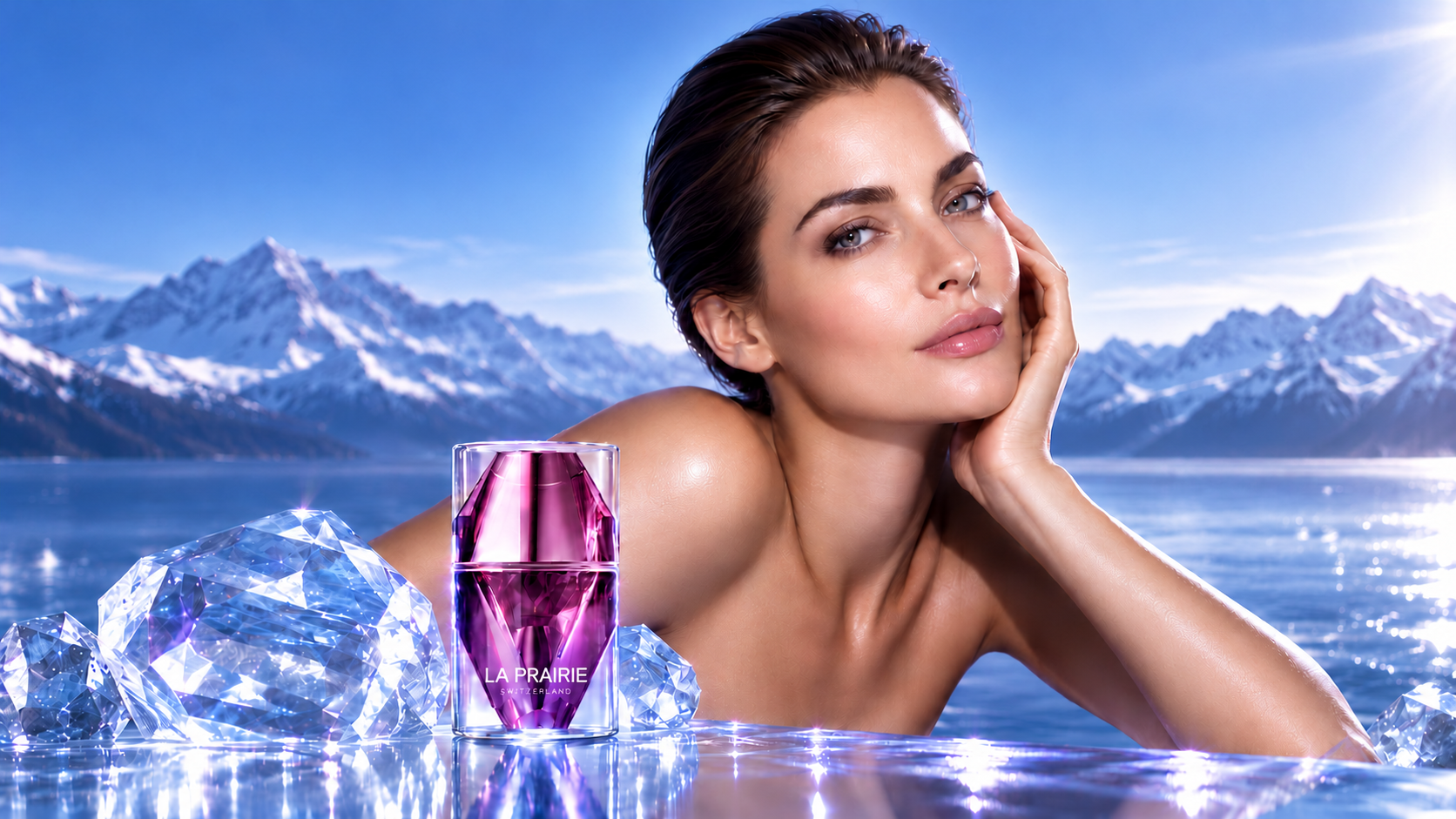
The enhanced visualisation demonstrates how art direction can change the perception of a product without changing the product itself.
By refining the lighting, environment, material contrast and composition, the image moves from functional product presentation towards a more expressive luxury visual language. The bottle becomes not just an object to be seen, but the centrepiece of a carefully constructed visual experience.
The approach strengthens the connection between product design and brand storytelling, creating a visual direction that can be adapted across digital campaigns, e-commerce, social media and retail environments.
Visual Merchandising Prototype